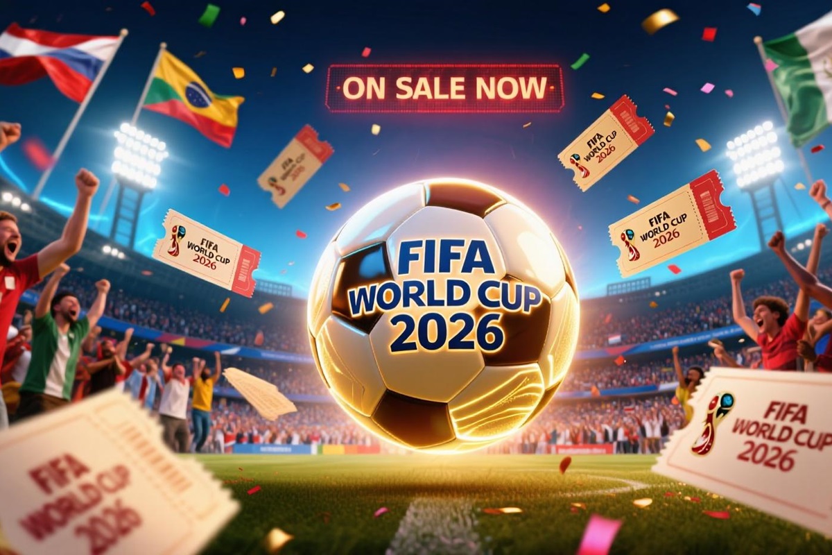
The FIFA World Cup 2026 will mark a before-and-after moment in soccer history. For the first time, three countries — Canada, Mexico, and the United States — will share hosting duties, in an expanded format that will bring together 48 national teams and offer 104 matches. The organizational challenge is evident, but the visual and symbolic challenge is just as great: How can the spirit of three nations and dozens of local cultures be captured in a single image?
The answer has arrived in the form of a groundbreaking logo and a brand strategy rooted in decentralization. Far from the rigidity of past editions, the 2026 World Cup aims to be a mosaic of identities, with a shared core that ensures unity and multiple local expressions that add nuance.
The Central Logo: Minimalism with Symbolic Weight
The main emblem combines two elements: a realistic image of the FIFA World Cup Trophy in the foreground and the number “26” in large type. This is no minor choice: it is the first time the actual trophy has appeared in an official World Cup logo. The number is not merely a date marker — it is made up of 48 geometric shapes (squares and quarter circles) that evoke both the pitch and the shape of a ball, symbolizing the 48 participating nations.
The color palette is understated: black, white, and gold — a neutral base that allows for multiple adaptations. The official typeface, “FWC 2026,” is inspired by the visual language of street soccer and the aesthetics of vintage posters, while a secondary font, Noto Sans, completes the system. The result is a design that, while divisive in public opinion, provides a versatile canvas for future applications.
Criticism and Defense
Not everyone has welcomed this approach. Some consider it overly simple, even underworked. Others, however, appreciate its adaptability, particularly for animations and digital media. Paradoxically, the controversy has amplified conversation and boosted the tournament’s visibility three years ahead of kickoff.
Related article: Art and Soccer: Art, Culture, and Football: The Official Posters of the 2026 World Cup Host Cities
WE ARE 26: The Slogan as a Backbone
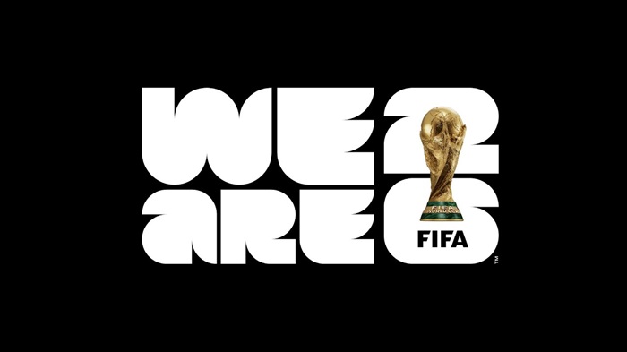
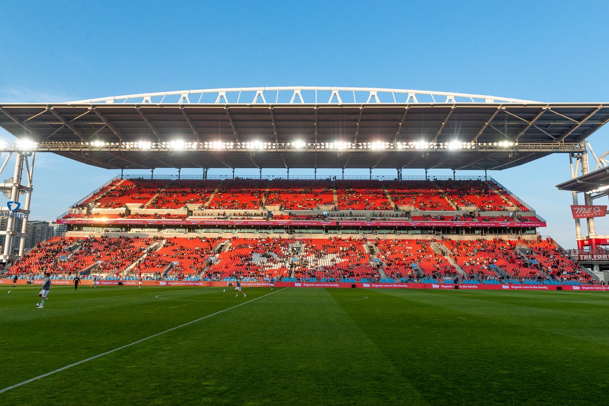
The official slogan, “WE ARE 26,” is conceived as a collective cry for unity. Its scope goes beyond the participating teams: it is a declaration of intent, aiming to integrate cultures, cities, and fans into a single narrative. And it goes beyond words. The brand strategy unfolds into 16 local identities, one for each host city.
Each host city was given creative freedom to reflect its personality. Los Angeles incorporates waves referencing its beaches; San Francisco highlights the iconic Golden Gate; and Houston uses a blue palette to convey innovation and diversity. Boston’s creativity resulted in a poster mixing historical references with marine characters, while Kansas City designed a composition blending soccer, jazz, and its culinary tradition.
This approach strengthens local ties and turns each city into an ambassador of its own story, without losing connection to the central logo.
Mascots: Between Anticipation and Local Initiatives
When it comes to mascots, the story is different. As of now, FIFA has not unveiled the figure that will represent the tournament globally. In the meantime, unofficial fan-created proposals have surfaced, some gaining notable traction on social media.
Mexico, for its part, has taken the lead with a regional mascot designed to promote Tulum as a tourist destination. Featuring the city’s brand and references to national identity, it is part of a campaign to position the location as a hub for peace and well-being. Such initiatives confirm the flexibility granted to hosts to leverage the World Cup platform according to their own objectives.
Historic Mascots: From Willie the Lion to Fuleco the Armadillo
Mascots entered the World Cup’s visual iconography relatively late. They debuted in England 1966 with “World Cup Willie,” a lion dressed in the British flag. Four years later, Mexico introduced “Juanito,” a boy wearing a sombrero and the tricolor uniform. Since then, each edition has sought to reflect national symbols: “Naranjito” in Spain 1982 embodied the country’s most iconic fruit; “Pique” in Mexico 1986 was a mustachioed jalapeño chili; “Footix” in France 1998 revived the rooster as a national emblem; and “Fuleco” in Brazil 2014 featured a native, endangered armadillo.
Some hosts opted for more than one character, such as “Tip & Tap” in Germany 1974 or the futuristic trio “Kaz, Ato, and Nik” in Korea/Japan 2002. While mainly aimed at children, mascots are also powerful mass-marketing tools, capable of remaining in collective memory decades later.
Merchandising as a Bridge to Fans
The brand’s decentralization is also reflected in the commercial strategy. FIFA has launched the “YOUR CITY. YOUR COLORS.” campaign, linking the World Cup’s image to neighborhood pride and the identity of each host city. City-specific official merchandise — T-shirts, caps, posters, and apparel — is sold as souvenirs, reinforcing a sense of belonging.
Beyond aesthetics, this approach turns the event into a series of local celebrations, each with its own symbols and products. The result is a World Cup not only watched on television but lived in the streets.
A Model for the Future
The 2026 FIFA World Cup is testing a new paradigm in managing the visual identity of mega-events. Unlike previous models, centered on a single static emblem, this edition bets on a minimalist shared core and a broad range of local cultural expressions.
The format has proven effective for a tournament spanning three countries and 16 host cities and could inspire other global events needing to balance unity and diversity. It is not without challenges — such as managing perceptions of the logo or coordinating multiple narratives — but it offers valuable lessons on how a brand can be both global and deeply local.
In 2026, the World Cup’s aesthetic will not be reduced to a single symbol: it will be a sum of perspectives, colors, and voices that together will form the identity of the biggest tournament in history.